Yes, it’s a YASP—yet another smartphone. But I definitely welcome this latest offering from Oppo.
Considered purely on a YASP basis, the new Reno 2 scores well on price per feature. But it also has a few unique selling propositions that, while not out-and-out sales cinchers, certainly sweeten the pot.
Would I swap the Reno 2 for the Huawei P30 Pro that has been my daily companion since its launch back in March of this year? Not willingly. But that phone costs around twice the price of the Reno 2.
I can say that if for any reason I found myself without the P30 Pro I’d be reasonably happy to continue with the Reno 2. There are a few features I would miss—I’ll touch on them later—but on the whole I think we’d get along just fine.

THE RENO 2 WAS LAUNCHED back in October of this year. Tested Technology isn’t known for being first with the news. But this time our alibi is something more than “in-depth testing” (although that’s part of it too).
A new version of Oppo’s ColorOS Android operating system has been teased by the manufacturer since even before the launch and by mid-December we’re still waiting for it.
The current version is based on Android 9. ColorOS 7 takes us to Android 10 and promises to be a major development.
We took the decision to split this review and hope you’ll be able to read about ColorOS 7 in part two. But let’s start with a rundown of the phone in general.
Specs, the How and Why
This is a very well manufactured smartphone, measuring 160 x 74.3 x 9.5mm and weighing in at 189g. It’s powered by an 8-core 64-bit Kryo processor embedded in a Qualcomm SDM730 Snapdragon 730G (8 nm) chipset. In English that translates to pretty damn powerful, but not the latest and greatest.
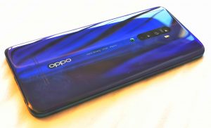
The version donated to Tested Technology for review is Ocean Blue.
The phone uses Gorilla glass for the screen and also for the back, enabling it to display beautiful opalescence in a choice of Ocean Blue or Luminous Black.
But, frankly, these bling colours mean very little to us, as the phone—like all our glass-backed phones—is destined to spend its working life inside a protective case. Once again, we urge readers to do the same. Gorilla glass is strong, but it’s still more glass than it is gorilla.
Happily, the basic case Oppo provides with the bundle just about fits the bill protection-wise (although I’d like to have seen more substantial corner bumpers guarding the screen). It’s handsomely constructed of faux leather with unobjectionable fake stitching and is modestly Oppo-branded.
The Reno 2’s Screen
The resolution is 1080 x 2400, an elongated 1080p ratio of 20:9 rather than the mass market entertainment standard of 16:9. However, this ratio is closer to wide-screen cinema.
Oppo is crowding in the pixels here approximately as closely as Huawei’s P30 Pro (around 400 pixels per inch). But this falls well short of the 512ppi of the Galaxy Note 9’s magnificent 6.4-inch Super AMOLED with its 1449 x 2960 resolution.
Do we care? This high ppi count on large smartphone screens is marginally helpful in displaying small text. But its contribution to the general display appearance is dubious. What isn’t in doubt is the increase in power consumption, as each pixel is an individual power sink. Recognising this, Huawei’s P30 Pro allows the user to choose between 2340 x 1080 and an energy-saving 1560 x 720.
The Reno 2 has no such option. But there’s plenty of other tailoring you can do with the screen. Under Settings/Display and Brightness you’ll find options to set the font size in five steps between Small and Extra Large. An additional setting, Display Size, adds a level of coarser tuning in three steps, Small, Standard and Large, which controls not just the text size but also the proportion of the other screen elements, like pictures and icons.
As its name implies, the ColorOS operating system also lets you fine-tune the screen’s tints and tones. A feature called Night Shield is designed to optimise the screen appearance depending on the time of day. You can toggle it on and off manually or get it to switch on according to a schedule.
- Display in Colour lets you lessen the amount of (supposedly*) harmful blue light from your screen that keeps you awake at night. You can adjust the resulting white point between Cool and Warm with a slider to your taste.
- Display in Black and White optionally turns your display monochrome using the same white point.
- Comfortable Night-time Reading inverts the monochrome display, showing white text on a dark background.
*…or perhaps not. See here.
The fingerprint reader is concealed behind the display, clearly marked with a glowing icon near the bottom of the lock screen. (More on that below…)
The selfie camera, too, is hidden behind the screen at the top.
The Selfie Camera
But not, sadly, in the same way as the fingerprint reader. Cameras that can see through an AMOLED screen will be on their way very soon, but haven’t made it to the Reno 2. Instead, this phone uses a technique that on paper sounds outrageously Heath Robinson*.
That so-called “shark-fin” selfie camera is the dominating innovation of the Reno 2, although the technology was introduced earlier this year with the first Reno.
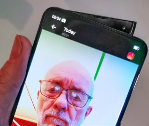 Its action is fascinating. But I do worry about the engineering decision to add mechanical functions to a device that has succeeded in becoming more electronic (reliable) and less mechanical (fewer fallible physical push buttons) over the years. The same remarks apply to phones with folding screens, which have had a rather bumpy ride of late.
This selfie camera is a simple enough 16MP, f/2.0 device but with software support that enables it, without the assistance of other cameras or dedicated depth sensors, to do a very decent emulation of a wide-aperture portrait camera.
Like most selfie cameras it seems to be fixed focus, which isn’t an issue for selfies taken at arm’s length or further using a selfie stick. Edges begin to look rather soft for pictures where the face fills the whole screen but even these are acceptable.
And if you worry about close-up selfies making your nose look big, Oppo’s Beauty mode is on hand with instant cosmetic surgery. Smoother skin, thinner face, smaller chin, bigger eyes are yours for the choosing.
And it knows a few tricks. In Portrait mode you can adjust the level of background blurring to approximate to the sort of shallow depth-of-focus shot you’d get from a wide aperture lens. Oppo calls this “bokeh“, the Japanese name for the out-of-focus effect you get in the background when you use a narrow depth of field.
The Japanese term implies an aethetic aspect, and, indeed, as well as helping to centre attention on the in-focus subject, bokeh can play visually pleasing tricks with background points of light. The Reno 2’s bokeh, created in software rather than by lightrays dancing between the elements of a complex camera lens, doesn’t rise to these aesthetic heights. Frankly, it’s just blurring. But within its limitations it works well.
There’s also the Pano mode option to create a panorama selfie for a group photo. You start by pointing the lens at the centre of the group, then slowly rotate it to the right and then the left. A small picture-in-picture inlay guides you through the process.
If you’re feeling frivolous and have no fear of being mocked by your mates, Sticker mode can supplement your portrait with a large selection of downloadable funny hats, halos, bunny ears, comic glasses and so forth. Included here is the popular (well…more so in the Far East, I understand) avatar feature that imbues a cartoon character with your voice, head, eye and lip movements to amuse your friends and scare the life out of your loved ones.
More usefully, perhaps you can take Time-Lapse mode selfies, movies that play back at ten times the speed in full 1080p. So although the camera is physically simple, it comes with software that imbues it with a lot of capabilities. It takes good regular videos, too—1080p at 30fps.
The Fin in Free Fall
Although I still worry about the mechanics of this selfie camera (particularly with respect to grit getting into the mechanism) it’s reassuring that at least one of the technical downsides has been taken care of by Oppo’s engineers.
They’ve anticipated the primary objection one might make to the idea—what happens if you drop the phone while the selfie camera is exposed? Modern smartphones have accelerometers and they know when they’re in freefall. Aware that the device is plummeting the shark-fin snaps itself shut.
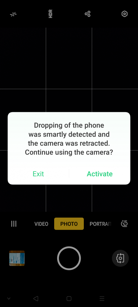
Well, that’s the official story. I tried to demonstrate this as safely as possible by holding the phone upside down and plunging my hand rapidly toward the floor, simulating a drop of 32ft/s2 as closely as I knew how. Multiple attempts failed to cause the shark-fin to retract.
I even invited colleagues who’d attended the launch to test their own Reno 2 phones in the same way. Feel free to imagine us all jumping up and down and waving our arms about. Tested Technology’s testing is nothing if not thorough.
But… no shark fin retraction.
I finally decided to put a stop to all this nonsense and actually dropped the phone. Onto upholstery, obviously.
The lesson here is that it’s not a matter of how much testing you do, it’s how you design the test (see also our battery testing below).
Detecting a descending acceleration at the authentic gravitational rate of 32ft/sec2, the Reno 2 accurately assessed the risk and the shark fin gracefully folded back into the chassis.
Battery
I do miss the generous capacity of the Huawei P30 Pro’s 4,200maH battery. The Reno 2’s 4000maH battery is essentially fine and holds up well most days. But after a busy day of testing the Reno 2’s various cameras, I found the charge was down to a dangerously low 13%.
And it’s not just that extra bit of capacity I miss. I’d become used to simply resting the P30 Pro on its wireless charging stand by my bed. With no wireless charging, I have to plug a cable into the Reno 2.
Certainly, this is less of a big deal since the arrival of the Type C USB connection. In the microUSB days you’d be messing about trying to get the plug the right way round.
But plugging in cables is, generally speaking, so last decade. We use Bluetooth headphones now (more of that in part 2) and we transfer our pictures and back up our data wirelessly over the LAN or across the Internet. I really hardly ever plug anything into these Type C sockets, apart from a charging cable.
However, Oppo’s proprietary fast-charging system, VOOC (Voltage Open Loop Multi-step Constant-Current Charging)* does a really good job if you need a juice boost in an emergency. Oppo claims it can charge from 0 to 75% in just half an hour.
Added together, the total of smartphones shipped by BBK rivals that of the world’s largest smartphone manufacturer, Samsung.
It took 53 minutes in total before that 75% charge was reached. And 90 minutes to attain full charge.
For our second test, we ran the phone absolutely flat before plugging in the VOOC charger. This time, 30 minutes charge took it to 79%.

The difference here is that the first test, starting at 1% charge, obviously left several processes running. These running processes were using up extra power while the phone was recharging. We were filling a leaky bucket.
The second test, starting with the battery absolutely flat, ensured that the phone was off during the charging period. Under these conditions, matching Oppo’s stipulation for the test, the company’s claim was met and comfortably exceeded.
VOOC RULEZ
Lock Screen Pros and Cons
A LCD pixel turns black by shuttering the backlighting at that point on the screen. Two problems: the light will inevitably leak round and through the shutter, showing as not-quite-black. And the backlighting will still continue to consume power.
Each AMOLED pixel is an individual source of light.
Rather than relying on generalised backlighting showing through coloured filters controlled by LCD shutters, AMOLED’s individual pixels are the original source of light. Only these illuminated pixels consume power. So screens using this technology should be able to run more economically, particularly in “Dark Mode” with a black background where most of the pixels are switched off.
A corollary is that AMOLED screens are capable of showing very crisp black tones rather than the washed out greys seen on some LCD screens. And the Reno 2 screen certainly exemplifies this.
Pushing this unlit pixel principle to the extreme, an AMOLED screen can be used to display small amounts of text data continuously by illuminating no more pixels than are necessary to create the alphanumerics. This allows phones like the Huawei P30 Pro to provide an informative Lock Screen, continuously showing, for example, the time, date, state of the battery and other snippets of information.
Oppo’s Reno 2 should be able to do this as well. And it does, although it took me a while to find how to turn this on, as ColorOS 6 hides the toggle in a different place from stock Android. It’s under Settings/Display and Brightness/Screen-off Clock. With this toggled on the black Lock screen will display the time, day and date as will as a small icon showing the battery percentage. Oppo warns that this feature will consume extra juice (although not very much) and lets you set a time window for it—for example, switching on at bedtime and off in the morning.
This information shows as dim white text but quite bright enough to be legible in a darkened room. When you pick up the phone, the movement triggers the appearance of the fingerprint reader icon, which makes startup very easy, even in the middle of the night.
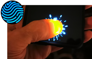
As a bonus, the fingerprint reader icon is animated. If you don’t touch it, it swims back into the depth of the screen. When you do touch it, it throws off Tesla-like plasma sparks.
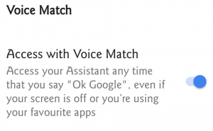
The Huawei P30 Pro allows voice access even when the screen is off.
While we’re on the subject, I can’t understand why ColorOS doesn’t let the idling Lock screen respond to “OK, Google”. You have to open the phone before it will respond.
It’s true that keeping the microphone awake is going to use to background juice—which is why other phones make this feature optional. The ColorOS toggle for this (well-hidden) in Google Home under Settings/Assistant Settings/Assistant/Assistant Devices/Phone only allows you to “Access your Assistant any time that you say ‘Ok Google’ when your screen is on” (my italics)
More Reno 2 to Come
You can read his notes on the Reno 2 here.
And it’s reinforced a view I’ve expressed here before—that those costly, top-dollar, big name brand, flagship smartphones may grab the limelight, but there are (if I may mix a metaphor) plenty of other interesting and capable fish in the sea.
And there’s lots more to say about this Oppo Reno 2. So far we’ve only covered the selfie camera. In the next part we’ll talk about the very useful array of cameras on the other side of the phone. And about the quirks and perks of Oppo’s ColorOS flavour of Android (let’s hope, by then updated to version 7).
Chris Bidmead
