Tested Technology has never rushed to publish its reviews. We regard it as fundamental that before we go to press we’ve not only tested out the product’s features but have also kicked it around long enough to relay to readers a good idea of what it will be like to live with.
One corollary of this is that we expect other publications to beat us to the punch with many of the products we write up. Less expected are the occasions when manufacturers themselves jump in ahead of us. But that’s exactly what Huawei has done with the GT2 Pro watch.
On the second of June, Huawei launched its Watch 3. It’s not a replacement for the GT2 Pro but it certainly is an immediate successor, deriving design ideas from its forerunner and building on the user experience with a new version of the operating system.
There’s a clear price differential between the generations. The watch we’re reviewing launched at an official price of £300 but you can now pick it up from the Huawei Web page for £180. The new Watch 3, released on the 18th of June, retails for £350. There’s a strong family resemblance between the two: whether the additional firmware features brought in with the new HarmonyOS operating system are worth the difference in price is something we hope to discuss in a future review. But for now, it’s clear that the GT2 Pro lives on in the market and the review we’re winding up here still has a part to play.
The first thing to report, following part one of this story, is that although this watch has been on my wrist daily—and nightly—for the past three months, there’s not a sign of wear anywhere. Titanium is a relatively soft metal, but the hard anodised dark grey surface finish Huawei is using has certainly done its job in warding off scratches. And despite the few knocks the face of the watch has endured, the sapphire crystal remains as good as new.
It’s also been in the bath and shower with me, with no ill effects. In the bath, you’ll need to be aware that after being under water for a couple of seconds the GT2 Pro will vibrate briefly. This worried me at first—was the watch complaining about drowning? Actually, no. Just warning that its Bluetooth connection had been interrupted. And it might vibrate once more when you emerge from the bath. But it’s only doing that to shake out any unwanted drops of water from its membrane-protected loudspeaker.
This is an extraordinarily well-made piece.
Exercising One’s Options
I reported earlier that lurking inside the watch is a transatlantic sports instructor whose cheery exhortations you’ll either come to love or loathe. During your workout, he will squeak out at you from the watch itself, or be relayed over Bluetooth to your headphones or (my preference) a minimum-presence audio device like the BeHear Proxy.
For a naturally exercise-averse couch potato like me, this sports instructor—Mr Aidy, as I’ve come to name him (from his pronunciation of the number 80)—is an indispensable call to action. During my daily exercise walks, I grew sweetly accustomed to his singing out my current heart rate, urging me to push it up to my limit and then pulling me back when I overshot.
The downside here, as I’ve mentioned, is that I’m probably listening to an audio book during this and his urgent interruptions make me miss sections of the story. The story narrator also lives in the watch in the shape of a collection of MP3 files, But the narrator and Mr Aidy are at odds with one another, something Huawei could definitely work on improving. The story narration should pause during Mr Aidy’s interventions. Or I should at least have navigation control over the streamed audiobook so I can wind back and replay the missing section.
I very much like the idea that the watch on my wrist holds not just a bundle of useful exercises and other features but also the whole of Mark Twain’s Huckleberry Finn, colourfully read by John Greenman in the Librivox edition. But for this to work properly, Huawei needs a better Music app.

Several improvements suggest themselves:
- The GT2 Pro can handle only a very limited number of audio formats. The omission of FLAC may be forgivable—its losslessly compressed files are large in comparison with MP3 and the benefit of FLAC’s much better audio quality might not be evident through the watch’s necessarily limited audio delivery mechanism. As a decent compromise it will accept AAC compressed audio as long as its bit-rate doesn’t exceed 320Kbps. The same upper limit applies to MP3 files. But here there’s another limitation—the sample rate has to be 32kHz or greater. This format fussiness means I often have to run file conversions before loading audio into the watch.
- The watch can only Bluetooth pair by way of the app. As there’s no version of the app for the PC or Mac, the phone becomes the only route for loading audio. When audio files need to be reformatted for the watch, the workflow very likely involves running them through an app like Audacity on the PC, then relaying them to the watch through the phone. This can get complicated.
- As I’ve mentioned above, navigation control of audio on the watch is minimal: stop, start, next track, previous track. Tracks can be sorted into folders, which might be helpful in some use cases. But audio books need more granular control.
- If you’re thinking of running proprietary audio books like Audible on the watch, you’ll need to manage your expectations. The GT2 Pro doesn’t understand the .aa and .aax digital rights managed formats. I asked Audible if they had any plans to develop a version of their app for the watch and they said no. I understand there are (dubiously legal) proprietary apps out there capable of converting .aa and .aax to mp3 but I’ve no experience of them.
Watch Faces
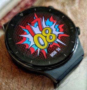 There are plenty of these—in ever-expanding numbers—to download using the phone app. Some are digital, some analogue and many are both. There are jokey, Toys-R-Us style watch faces, deadly serious watch faces, illegible watch faces, highly informative watch faces and classic watch faces. One crucial distinction, though, is between regular watch faces and always on watch faces.
The regular watch faces burn juice, showing a good deal of detail and refreshing the AMOLED screen every second to move the second hand along. By default, the screen will be black and these faces only appear when you press the upper button. Alternatively, you can set up a feature called “Raise to wake”, designed to switch the screen on automatically when you lift your arm.
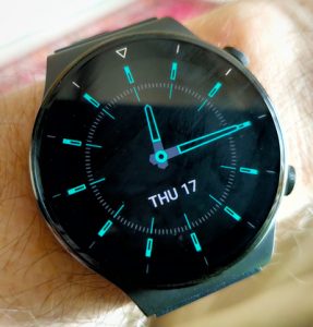
If you must have the time showing constantly, there are six system faces built into the watch that will do this. They are minimal, outline faces without a second hand that only refresh every minute. My favourite, pictured above in paragraph one, shows analogue time with green outline hands and hour-marker batons and also displays the day of the week and the day of the month in white. If you set up one of these six always-on faces, you’re warned that this will cut your battery life in half and disable the Raise to wake feature.
If you’re using any of these always-on displays, you need to hit one of the buttons to switch to the regular watch face you’ve chosen. You can also just touch the watch face to do this. But it’s worth noting that if you’ve chosen not to use an always-on display, as well as switching off the display while in repose, you’ve also switched off the screen touch sensitivity. A completely blank screen is only revived by Raise to wake or when you touch a button.
The watch can hold a number of different regular watch faces that you upload from the app. Once you’ve loaded your selection, you switch between these by holding a finger on the display until the watch face shrinks to a smaller circle. Then you can swipe left or right to select any other of the uploaded watch faces.
Missing among that huge variety of uploadable watch faces was any kind of GMT watch. These have a fourth hand in addition to the hour, minute and second hands, that is used to track the hour value of some distant time zone. So when it’s 6.30 pm here in the UK, if the extra GMT hand is set for Vancouver (say) it will be pointing half-way between 10 and 11, indicating 10.30. You won’t know whether this is am or pm—that’s supposed to be left to your common sense.
I did find one watch face with a fourth hand. But this is simply titled “24-hour time”, with the “GMT” hand merely tautologically displaying the current local time.
A few of the watch faces are user-configurable, like the one called Gallery, which allows you to apply your own backdrop and gives you a limited choice of font and where to place the digital time information.
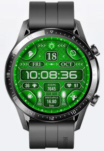
A particularly interesting watch face is the one with the catchy name, jwD62Gre, illustrated here. As well as showing the digital time, with day, date and month, small windows also display the number of steps you’ve taken, the distance travelled, your current heart rate and your stress level. But each of these windows is also a touch button, taking you to the relevant app. So that a tap on the heart rate window opens up the heart rate monitor, where you can also see your resting heart rate as well as your current maximum and minimum together with a graph of your recent changes.
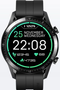
But wait, as they say, there’s more… The four flattened semi-circles around the circumference are also touch-sensitive buttons, giving you direct access to (starting at the one o’clock position and moving clockwise) the timer, the music app, the alarm and the weather.
This jwD62Gre nicely illustrates the capabilities of the watch. But it’s a cluttered display and my personal preference is for the one called Simple Digital. This has no touch-button tricks up its sleeve. It simply shows the time and date very clearly, as well as the number of steps you’ve taken, how many calories that’s burned and your current heart rate. And the green ring around the circumference gives you instant crucial information on a factor we’ll discuss next: the battery status.
The Battery
The GT2 Pro is advertised as having a battery duration between charges of two weeks. That’s assuming you’re not using the always-on display and few if any of the sports and health features. I began testing this but quickly realised this to be a waste of time, as it’s not a real-world scenario. You simply do not spend this kind of money on a smart watch if you’re not going to make use of the smart features. The two-week metric is only there as a marketing tick-box.
So I switched on continuous heart rate monitoring, began spot-checking my SpO2 twice a day and used the watch for my daily workout (a very modest half-hour fast-paced walk). In this mode, the watch will need recharging every five days or so.
But that isn’t how I’m running the watch now. You’ll try many different ways of coming to terms with any new gadget and eventually settle on whatever works best. I had thought that the ability of the battery to charge the watch for a long time would be a killer feature. I learnt I was wrong.
The first hint of this was when the phone rang while I was sitting in the bath. My phone was in my office—too far away for me to hear it. What alerted me was the vibration on my wrist. This was when I discovered I could answer the phone by pushing a button on the watch. And not only hear the caller but also carry on a complete conversation. I was Dick Tracy. In the bath.
This was also when I discovered I didn’t want to be Dick Tracy in the bath. And while I gave that matter some thought, I came to the realisation that I wasn’t all that interested in measuring my heart rate in hot water. Or in tracking my tweets. Or, indeed, while bathing, any of the other fancy functions the GT2 Pro had to offer. Except, perhaps, time. There is, however, a clock in the bathroom.
I had been wearing the watch in the bath purely because the IP rating said I could. And having established that, I realised that bath time would be the perfect opportunity to charge the watch each day. Just a quarter of an hour or less on the Qi wireless charger provided with the watch would be more than enough to keep the GT2 Pro plump with electrons, even if I put it on the charger only three times a week.
The Menu System
The watch comes with 21 separate apps, listed in a column that you access by pressing the upper button when the main watch face is showing. If you’re using one of the Always On watch faces you’ll need to press this button twice—once to bring up the standard watch face and then again to reach the menu.
With the menu displayed, running your finger up and down the watch face will scroll this rather lengthy list vertically. Having lived with the watch for several months now, I still feel this is an awkward method of menu selection. The timer, which I use often, is towards the bottom of the list and the heart rate, SpO2 and exercise functions are towards the top of the list. Choosing between these by scrolling up and down takes longer than it should. It helps a little that you can spin the list with a flick of the finger.
Evidently, Huawei has acknowledged this awkwardness too. The newer version of the watch allows a spread-and-pinch zoom in and out function, the individual apps being represented by icons instead of text. It was my understanding at the launch of this new watch that operations like these, part of the new HarmonyOS operating system, will be migrating to the GT2 Pro later this year.
Meanwhile, we’re stuck with this ungainly list. You can’t reorder it, but you can pick out your own selection of functions in Settings/Display/Favourites. This won’t change the list but your favourites will now appear in order when you flick sideways from the main watch display. But there’s a catch to this.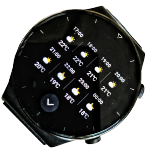
The Weather app, for example, when evoked as a Favourite, shows a screen similar to the one you pull up from the main vertical scrolling app list. The day’s weather information and the current weather icon is slightly shrunk to make room for Moon information below it.
Moon information isn’t shown on the face of the main app because the main app face can be scrolled vertically though a total of eight different faces. Each of these faces displays more weather information, including the current day’s weather hour by hour, a summary of the weather over the upcoming week, the current position of the Sun, with sunrise and sunset times and two screens of Moon information. The final screen graphically represents data about the tides in your area. Left and right arrows on any of the Sun, Moon or Tide screens page you through five days of future information.
So the full-featured Weather app offers copious weather-related information. The Favourites Weather screen you get when you swipe sideways from the main watch face is merely a static display. So although it seems you can make an app more accessible by setting it as a Favourite, in reality you’re just getting a static representation of the app, updated with a small portion of its current information. I have absolutely no idea how or why Huawei could come to this bizarre design decision. Let’s hope this is fixed in the upcoming HarmonyOS.
Is this watch worth the money?
This is the key question. A well-made titanium watch with a scratch-proof sapphire crystal that keeps time better than any costly mechanical chronograph seems to be a snip at the current price of around £180 from the official Huawei Amazon UK Store. But, unlike that mechanical chronograph, the chances of your handing it down to your grandchildren are slim.
In fact, the GT2 Pro will certainly be off your wrist before the end of this decade. The official specifications don’t have a metric for the overall lifetime of the rechargeable battery, but unlike many quartz watch batteries it’s not designed to be user replaceable. Let’s conservatively guess that you’ll get a solid five years of use. After this, you’ll either chuck the watch or take it in to have its battery replaced for not much less than half what you paid for it (disassembly needs steady skilled fingers and specialist equipment). By that time, new smart watches—perhaps not of this build quality, but certainly smarter—will be on sale for very much less.
In the best-case scenario, Huawei’s new HarmonyOS will breathe new life into the GT2 Pro before the end of this year. That should give you an up-to-date smartwatch that, at the current market price, will provide you with five years of useful life for a shade over £30 a year. There’s no question in my mind that the watch is a delight to wear as well as being immensely useful as a general time tool and health tracker.
My only sadness is that at some point in the future the electronics will be outdated and/or die and a beautifully manufactured sapphire, titanium and ceramic artifact will have to be consigned to the junk heap.
Chris Bidmead

