Six years ago when I picked up the first Samsung Galaxy Note, I knew at once that this was the right form-factor for a phone. And it still fits in your shirt pocket.
Since then I’ve dallied with smaller phones, because these still abound. But late last year, the Huawei Mate 9 arrived. And it was like coming home.
Huawei Mate 9

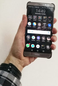
The Huawei Mate 9 is supplied with a minimalist polymer case that leaves the edges clear but robustly protects the corners.
THERE ARE TWO VERSIONS of the new Huawei Mate 9. The one I’m reviewing here is the basic model, currently selling for prices between £550 and £700. It comes with 4GB of RAM and 64GB of storage, optionally extendable to 256GB with a microSD card.
The large IPS touch screen measures 5.9″ diagonally, taking up most of the front surface. It’s 74mm across, and the phone itself is just 79mm wide, so very little is wasted at the edges. The chin and forehead are pared down too, so the 132mm height of the screen is sandwiched between a 10mm bezel at the top with 10.4mm below.
Bottom line: the phone fits nicely in the average hand, housing a screen large enough (I found) to do virtually everything I’d want to do on a tablet.
Porshe Design Edition
If you’re feeling flush and need a phone that flashes a sporty logo, there’s also the Porsche Design Edition. It has much more memory and will set you back something in the region of £2000.
That’s well out of my league, and I’m not going to write about it here.
Except to say that from what I saw of the Porsche Design Edition at the launch I was underwhelmed. Yes, the RAM allocation at 6GB is generous, and the on-board storage of 256GB is huge. But the rest of the phone’s entrails are the same as the regular Mate 9.
The only other major difference is the screen. Although it’s higher resolution (2560 x 1440 pixels), curved at the edges and uses AMOLED for a really crisp display, at 5.5″ the screen seems to me ungenerously small. It’s not just that it’s set into a narrower body than the regular Mate 9. It’s also squeezed vertically between a chin that has been extended to include an old-fashioned hardware Main Menu button and an oversized forehead bulked up to make room for a pompous “PORSCHE DESIGN” banner.
The best design just IS. It doesn’t need to shout out its name.
Hard to Fault
I should tell you up front that it’s not going to be easy to be objective about the Huawei Mate 9. There were over 500 international journalists at the Munich launch in November last year, where we were presented with a spectacular song-and-dance stage show, themed around Huawei’s catchy brand song “Dream it Possible” sung by Delacey.
All of us queued up to collect a Mate 9 afterwards.
So, like the Huawei P9 (and much else reviewed here) we’re tempted by a “review to keep” product. But that’s not the root of the objectivity problem. Regular readers will know by now that Tested Technology makes a point of holding even the most generous manufacturers at arm’s length.
The problem I’m having is that it became clear, even after the first week’s acquaintance, that this would be a very hard phone to fault.
The UK wasn’t originally intended as part of Huawei’s “first-wave” launch schedule, and the invitation to UK journalists arrived at the very last moment. The Mate 9 only became officially available here in the UK this month (January), which partially explains my delay in reviewing it.
The other part of the explanation is that I’m still looking for criticisms I can relevantly make about this device. That’s proving to be a tough call.
Right-sized, Sharp-eyed
I’m probably biassed, but it became clear to me back in the day of that first Galaxy Note that now that the phone has become your main browsing device, your pocket diary, your tweeting machine, your satnav, your ebook reader and so much more, that extra screen real estate is a necessity. The Note 1 had a 5.3″ diagonal screen; the Mate 9 pushes this to 5.9″ although the phone is physically 3mm narrower than that Note. This is real progress.
So the Mate 9 wins my heart on size.
The other key aspect that sells me on the Mate 9 is the camera. I find I’m using phone cameras more and more for a widening variety of different applications. My standard test of a phone camera used to be whether it can take a readable photo of a newspaper broadsheet double page spread, but the technology’s moved far beyond this by now.
Nougat on the Menu
The only thing wrong with this newest (Android 7) version of the world’s most used mobile operating system is the way our cousins across the water pronounce its nickname. The Mate 9 comes with Nougat already installed, together with a much-modified version of Huawei’s home-grown interface, the Emotion UI.
Nougat (“our sweetest release yet”, crows Google. Ugh!) is pretty damn good, and IMHO is now streets ahead of the competition from Apple and Microsoft (if Microsoft can be said to offer much in the way of competition here).
Android 7 introduces several new features, but my favourite and most used is a double-tap on the Recents button.
A single tap on Recents brings up a list of the recently used apps, as it did on earlier versions of Android. A double-tap flips between the current and immediately previously used app. It’s a small, subtle change, but it makes a great deal of difference if you’ve become used to the mobile phone way of working. Let me explain…
Folks still anchored to computers often tell me they need the 13″or 15″ screen because they can’t work without having multiple windows up on the screen at the same time. I find this clutter of windows distracting and clumsy, and for a long time have used the Mac’s ability to switch between virtual desktops instead, with one app occupying the whole screen in each desktop.
You don’t need to see multiple apps at the same time as long as:
- You can switch swiftly and
- The system has an intelligent clipboard for copying data between apps.
Once you’ve learnt to work like this on a computer, you can implement the same workflow on a mobile phone with these same two features. I haven’t found Android’s own system-wide clipboard quite good enough for this (you can’t, for example, look up a list of recent saves and switch to the data you copied four copies previously). But there’s a marvellous app called Clipper Plus that does the trick beautifully.

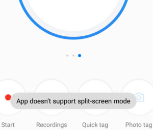
Some apps, like Huawei’s built-in Sound Recorder, won’t work with the new split-screen mode
If you insist on multiple windows, Android 7 now makes this possible. It’s something Samsung phones have been able to do for some time, and as with the Samsung implementation, in Android 7 there are some apps that will politely refuse to share the screen.
Just long press on the Recents button and if you’re in portrait mode the screen will split horizontally to show the current and previously accessed apps. In landscape mode the split is vertical.
Another feature of Nougat that games players in particular will appreciate is the new Vulkan graphics API. Given the right hardware (and the Mate 9’s Kirin 960 falls into that category) graphics performance gets a huge boost. Huawei claims that Vulkan on the Mate 9 increases this by up to 400 percent.
EMUI 5
Huawei Emotion UI (EMUI) has come in for a great deal of flack in the past for messing with the Android experience. The chief complaint was that it did away with Android’s App Drawer, which stores the totality of installed apps out of sight, leaving the working desktops clear for just the apps you want to get to quickly.
EMUI 4 gave you no option other than to keep all the apps in full view (I assume in homage to the iPhone, which works in the same way). With EMUI 5 you have a choice between using the App Drawer or working in iPhone mode.
A refinement to Recent Apps adds a lock button as well as the standard Android close button to each window in the stack. Now you can quickly lock the individual apps you want to keep open and just hit the Bin button to get rid of the rest.
As with the previous version of EMUI, to use the large phone one-handed you can shrink the screen with a thumb swipe to the left or right (depending on which direction you want to shrink it in). And EMUI 4’s often derided “knuckle mode” is still there… And I’m very glad it is.
Journalists have mocked this feature, but I find I’m using it all the time. Double-tapping on the screen with a knuckle seems to me a surer way to take a screen shot than pressing Volume Down and the Power button simultaneously.
And a single tap that ends up describing an S shape is an invaluable way of taking a “scrolling screenshot” of an entire Web page or a complete chain of emails and their responses.
 The other knuckle mode I find I use regularly is similar to the “partial screenshot” I got into the habit of using with the Galaxy Notes. With the Mate 9 you don’t need a stylus: just tap once and then keeping your knuckle in contact with the screen, describe a rough periphery around the area of interest (the blue squiggle in the picture on the left). The knuckle path doesn’t have to be exact, because you can modify it or change it into a square, circle or heart shape of adjustable size and position before saving the shot (see right hand picture).
More to come
I’ve hardly touched on the all-important dual camera. Clearly there’s a great deal more to be said about the Mate 9, which I’m going to carry over to part 2.
Meanwhile the phone has just become available in the UK from Three for £550 to buy outright or on various 24-month contracts.
Chris Bidmead
