In my review of the Cyanogen-based Wileyfox Storm I welcomed the arrival of the new generation of modestly priced smartphones, functional without being flashy, more “burners” than “bling”. I saw the nearly disposable utility smartphone as a trend worth encouraging. Flagship phones, I argued, have had their day. Hardware is transitory; don’t fall in love with it.
Huawei’s latest sleek and slim top-end P9 has gone some way to changing my mind. I’ll try to explain why.
 The P9 was launched on Wednesday the 6th of April, 2016 in the Battersea Park Evolution, a hall packed with IT journalists from all over the world. The scale of the event was reminiscent of the heyday of Apple at the turn of this century, with one important difference. Wresting review samples from Apple has always been a blood-from-stone exercise. But at the end of Huawei’s elaborately staged press presentation, the entire audience queued on the way out to collect a P9 in a goodie-bag.
So, full disclosure, Huawei gave me the sample I’m reviewing here. Actually, they don’t like saying they gave it to me. They “gifted” it to me. The implication here is that I have not merely been bunged a piece of kit, I have, rather, been bestowed a collection of talents, skills, powers and other desirable qualities. And actually—they have a point.
Look and Feel
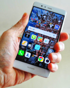
Only 6.95mm deep, the P9 is the thinnest phone ever to cross my desk. Its 5.2″ screen is a shade smaller than I’d prefer, but it runs left and right almost to the very edge, making the most of the physical size of the phone. And it’s bright enough to be read in sunlight.
Some reviewers have been disappointed that the resolution of the IPS screen is only 1080×1920. Personally, I’d have preferred OLED (the screen technology used in Huawei’s larger P9 Plus) but with a phone this size I have no problem at all with regular HD resolution. Pushing more pixels eats more juice. (And the P9 screen has a trick up its sleeve about this, as we’ll see.)
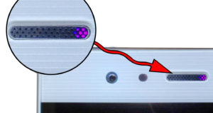
 There’s only a single loudspeaker, at the bottom edge of the phone, and a smaller phone earpiece speaker embedded into the upper bezel, to the left of the front-facing 8Mpixel camera and its associated LED flash. My first thought was that the standard Android multi-coloured LED notification light was missing, but this turns out to be a tiny pinhead LED discreetly concealed behind the earpiece speaker grille. Possibly a little too discreetly—its easy to miss in daylight.
I was glad to escape the physical navigation buttons that phones like my Samsung Galaxy Note have required us to live with over several generations. The P9’s virtual navigation buttons are instantly responsive, although not configurable in the way I’d found useful on the Wileyfox Cyanogen phones, the Swift and the Storm. One neat feature of interest if you like to use your phone one-handed: a left or right swipe across the navigation buttons will shrink the active screen to about three-quarters size, putting everything in reach of your thumb.
 The phone fits very comfortably in the hand and the two buttons on the right-hand side—a volume rocker at the top, and below that the power switch—fall nicely under your first and second fingers. On the left-hand side is a flush-fitting SIM tray, which will optionally also take a microSD card. Asian versions of the P9 can also accommodate a second SIM; sadly, the UK isn’t seen by phone manufacturers to be a dual-SIM market, and with rare exceptions like the Wileyfox Swift, UK phones seldom offer this feature.
My review sample is Ceramic White, with all-metal silver edging and backing. Other available colours will be Haze Gold, Rose Gold, Titanium Grey, Mystic Silver and Prestige Gold. These names alone are enough to tell you this is a bling phone, which of course poses the classic bling phone dilemma: naked splendour or protective case?
I’m essentially risk-averse, and all my earlier costly phones have lived in rugged armour. But it seemed a pity to hide the slim elegance of the P9, so I tentatively decided to try living, at least for a while, with the phone uncased. The shirt pocket has always seemed to me the natural habitat for a phone—the back pocket of one’s chinos being the very last place you’d want to put something like this.
But shirt pockets become hazardous when you’re stooping down. I remember sending my very first iPod crashing onto a tiled floor when I bent to pick up a dropped wallet. And the P9’s slender profile and smoothly rounded edges seem designed to guarantee a swift trajectory towards doom the moment, when in bending down, the right launch angle from the shirt pocket has been achieved.
But let’s see how that goes.
The P9’s Not Just a Pretty Face
If looking fit were the P9’s only talent the thing would be in a display case in my living room, and none of this would be a problem. But more than any other phone, this is one I really want to keep with me, if only for the camera. Much has been written about the P9’s Huawei/Leica co-operation, perhaps because the Battersea Park Launch majored on it. The optics are certainly good and ingeniously implemented, and I intend to cover this aspect of the P9 in part 2 of this review. But for now I’ll focus (aha!) on the other features that, at least in my opinion, are equally newsworthy.
Single Digit Lock Code
A smartphone is a very personal thing, and you may well want it to operate only when you say so. Marshmallow offers a number of different way of locking the phone against intruders, and among these the P9 includes fingerprint reading.
Level 1. Ridge Flows look for general patterns: loops, arches and whorls. Level 2. Examines the image for “Points”, which are bifurcations of ridges, ridge endings and isolated islands, known as “dots”. Level 3. Ridge Path Structure, which is the precise way the individual ridges are shaped. Level 4. Ridge Depth, as the name suggests, measures the finger surface three dimensionally.
In the past I’ve given fingerprint unlocking wide berth as a fiddly, hit-and-miss technology. Huawei claims to have ironed out the problems, chiefly by adding another dimension to the recognition parameters used in earlier sensors. Ridge Flow, Ridge Formation and Ridge Path Deviation—all two-dimensional metrics—comprise the data for regular fingerprint analysis, not just in new devices like our phones, but historically for the kind of detection we know from TV cop shows.
The new sensor takes advantage of the fact that it’s looking at a real finger, not just a print. So it also includes Ridge Depth (see Box). It seems to be this level of accuracy that makes the P9’s fingerprint unlocking so swift and therefore—at last—actually useable.
The Operating System and Emotion
Hardware runs operating systems; operating systems run on hardware. So I’ve never grokked the current fashion for saying a phone runs ON Android, as if Android were a kind of fuel that you pour into the thing, like petrol into a car.
The P9 runs Android 6.0 (Marshmallow), which is not quite the latest update, although it’s recent enough to include several striking new features.
The first thing to strike a regular Android user will be Huawei’s eccentric “Emotion” user interface, EMUI, for short. In a word, it’s weird. Perhaps the biggest shock is that the Emotion UI has no separate Apps Drawer and Desktop. Following along the lines of Apple’s iOS, the Desktop is the Apps Drawer, and there’s no bilevel structure to allow you to pick out and headline the apps you use most.
Well, that’s how it strikes you at first. And you may rush to install an alternative launcher (Nova, for example) to remedy this. But this was my second round with Emotion, and this time I decided to roll with the punches to see if I could make the UI work for me.
It turns out to be not too bad if you’re prepared to change your thinking. The combined Apps Drawer/Desktop (let’s call it the AppsTop) has multiple pages, and you can freely move your app icons around on it. So the first thing you do, obviously, is put your most used apps on the front page.
You can go further with this by grouping your apps into folders. As with regular Android, dropping one app icon on top of another is all you need to do to create a folder, which you can then give a meaningful name.
OK. But the value of Android’s standard separate Apps Drawer is that you can arrange all your icons there in alphabetical order, making it very easy to pick out the ones you use less often. There’s usually some kind of alphabet slider to speed up the selection. At first I felt lost without this.
But there’s a cunning twist to Emotion. In the AppsTop, dragging your finger down from anywhere except the very top of the screen, which of course pulls down Notations, blurs the background and brings up a search bar and icons of your most recently used apps. The search bar will first find your apps, but also check through your contacts and messages for anything relevant. In practice you may find, as I did, that this more than makes up for the absence of a conventional sorted Apps Drawer.
Another change from stock Android is the way the Notifications drag-down function can be split. In regular Marshmallow a drag-down from the very top of the screen unrolls Notifications access, and a further drag-down on that screen reveals the Shortcuts panel for setting things like screen brightness, Bluetooth, NFC and so on. EUI optionally lets you split the drag-down, so that a drag from the left hand side of the screen produces Notification, but the same action on the right-hand side unveils the Shortcuts.
Alternatively, you can arrange for the Notifications drag-down to show notifications only when new ones have appeared, otherwise jumping straight to Shortcuts. The tweak is no big deal, but I’ve found it useful.
Battery
Surprisingly for a phone this thin, the P9 is powered by a high capacity 3000maH battery. On a couple of occasions I ended a day of heavy testing with between 20% to 35% left in the tank. With typical use you can expect to get a day and a half, although I definitely still prefer a removable battery (and/or wireless charging), even if this would make the phone thicker.
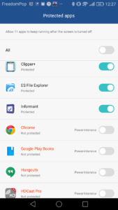
In part this impressive battery performance is because the Emotion UI indulges in some very aggressive battery-saving tactics. It appears to assume that all user-installed apps will be abusing the battery, and therefore by default closes them all down whenever the screen goes to sleep. I was baffled at first by the failure of the superb Clipper+ app, which I’ve been using successfully for years to manage Android phone clipboards.
To maintain the contents of everything you’ve clipboarded and to sync that list to your other phones and the Cloud, Clipper+ needs to be running continually. The P9, I discovered after a day or two, was repeatedly shutting it down.
 The solution is buried deep in the phone’s settings, under Advance Settings/Battery Manager/Protected Apps. You’ll find a list of all your user-installed apps here, each with a switch you can slide on for the ones you want to run continuously. A master switch allows you to keep them all running. Flicking this to “On” might not be such a bad idea: Android is already pretty adroit at managing background apps and shutting down unwanted juice-hoggers. If Protected Apps were renamed Curfewed Apps, with a blacklist to catch the rogue apps that were somehow escaping Android’s default management, this might be a more useful (and less confusing) feature.
I mentioned above that the modest screen pixel count probably goes some way towards battery saving. If you’re trying to squeeze the utmost out of your battery, Emotion UI lets you take this a step further. Under the Battery Manager setting there’s an option called “Enable ROG Power Saving”.
I’ve no clue about what “ROG” stands for, and neither, apparently, has Google. For my own piece of mind, as it turns out to be an option to reduce the graphics resolution, I’m going to assume it’s “Reduced Option Graphics”. Switching this on requires closing all the running apps, and when they return they find themselves playing to a 720×1280 screen.
This isn’t as punative as it sounds. I expected the fonts to suffer (I use the small font option on the P9), but the difference is very hard to distinguish in normal use. The only time I really become aware of it was when using MirrorShare (under Advanced Options) to cast the screen to my 1080p Viewsonic projector.
In part 2 of this review I’ll be looking at the P9’s multimedia functions, including, of course, that dual-lens Leica camera.
Chris Bidmead
